0 comment(s) so far. Please add yours!
I wrote this two weeks after surgery (more on that later) as I sat in bed crying because the news sucks, there was another form to fill out, I found out I couldn’t go to the Vegas party this weekend, and plus I couldn’t wash my hair. I formatted it as an image to post on Twitter and Bluesky, but then forgot to do it.
It really is, still, shocking to me that whether or not I’ve eaten and what I’ve eaten has such an effect on me, especially since I’m rarely hungry. I know I’m not alone in this. I have a friend who told me that whenever she and her dad would be in a discussion/disagreement and it started to get heated her dad would say something like “I’ll continue this after we’ve both eaten an apple.” This seems like a really good idea.
Since I’m only cooking for me these days and I’m home recovering I can forget to eat or remember but it seems like too much trouble / easier just to go to sleep. Especially if, say, I’ve been writing some Inez stuff or reading or practicing calligraphy. Just about anything is less boring than cooking1When I say cooking here I mean the day-to-day keeping myself fed kind of stuff. More elaborate cooking and baking is different and interesting. and eating.
Clearly my more responsible inner self needs to keep better tabs on what I’m eating when because there’s always time for a protein shake.
Text version for those who use Readers:
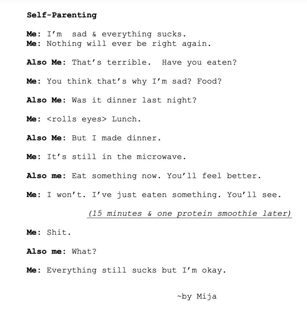
Self-Parenting
Me: I’m sad & everything sucks.
Me: Nothing will ever be right again.
Also Me: That’s terrible. Have you eaten?
Me: You think that’s why I’m sad? Food?
Also Me: Was it dinner last night?
Me: <rolls eyes> Lunch.
Also Me: But I made dinner.
Me: It’s still in the microwave.
Also me: Eat something now. You’ll feel better.
Me: I won’t. I’ve just eaten something. You’ll see.
(15 minutes & one protein smoothie later)
Me: Shit.
Also me: What?
Me: Everything still sucks but I’m okay.
~by Mija
- 1When I say cooking here I mean the day-to-day keeping myself fed kind of stuff. More elaborate cooking and baking is different and interesting.


 I’m currently trying to decide whether Scrivener
 Even with getting to hand out with Rex and Adalia, my biggest September news is <cue trumpets>: after being abruptly shuttered five years ago,